David Austin Roses Website Improvements
During my time at Thought & Mortar I reviewed and refined the David Austin Roses website. David Austin Roses have been breeding roses for over 60 years and are well-known and respected in their industry. Their website is already high performing but throughout my time at Thought & Mortar, I identified areas where improvements could be made.
These improvements were focused on the product page, the cart, and the checkout. I identified where improvements could be made by following best practices and by analysing the Google Analytics and Hotjar data.
Please note: These designs are conceptual and haven’t been implemented.
Client:
David Austin Roses
Agency:
Thought & Mortar
Date:
2021 – 2023

My recommendations
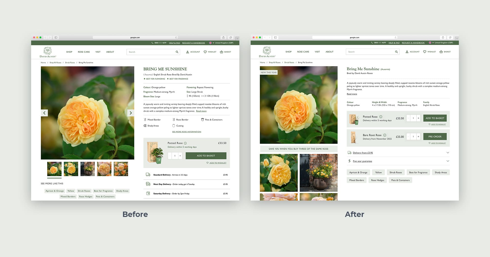
On the left is the existing David Austin Roses product page, and on the right is my recommended version. My main priority was to enable the two products to be visible and next to each other. Currently, the second product isn’t even visible on the one on the left, due to the large amount of information at the top, the depth of the ‘Add to basket’ tile, and the detailed delivery information below the first tile. By widening the information area, reducing and reordering the content, I’ve created a much more digestible and user-friendly interface. David Austin Roses also have such beautiful photography that it seems a shame to hide away the images in a slideshow, so by moving the content that was under the imagery to the right hand side it’s given space to create a gallery below the main image.
