Thought & Mortar Brand Refresh and Website Redesign
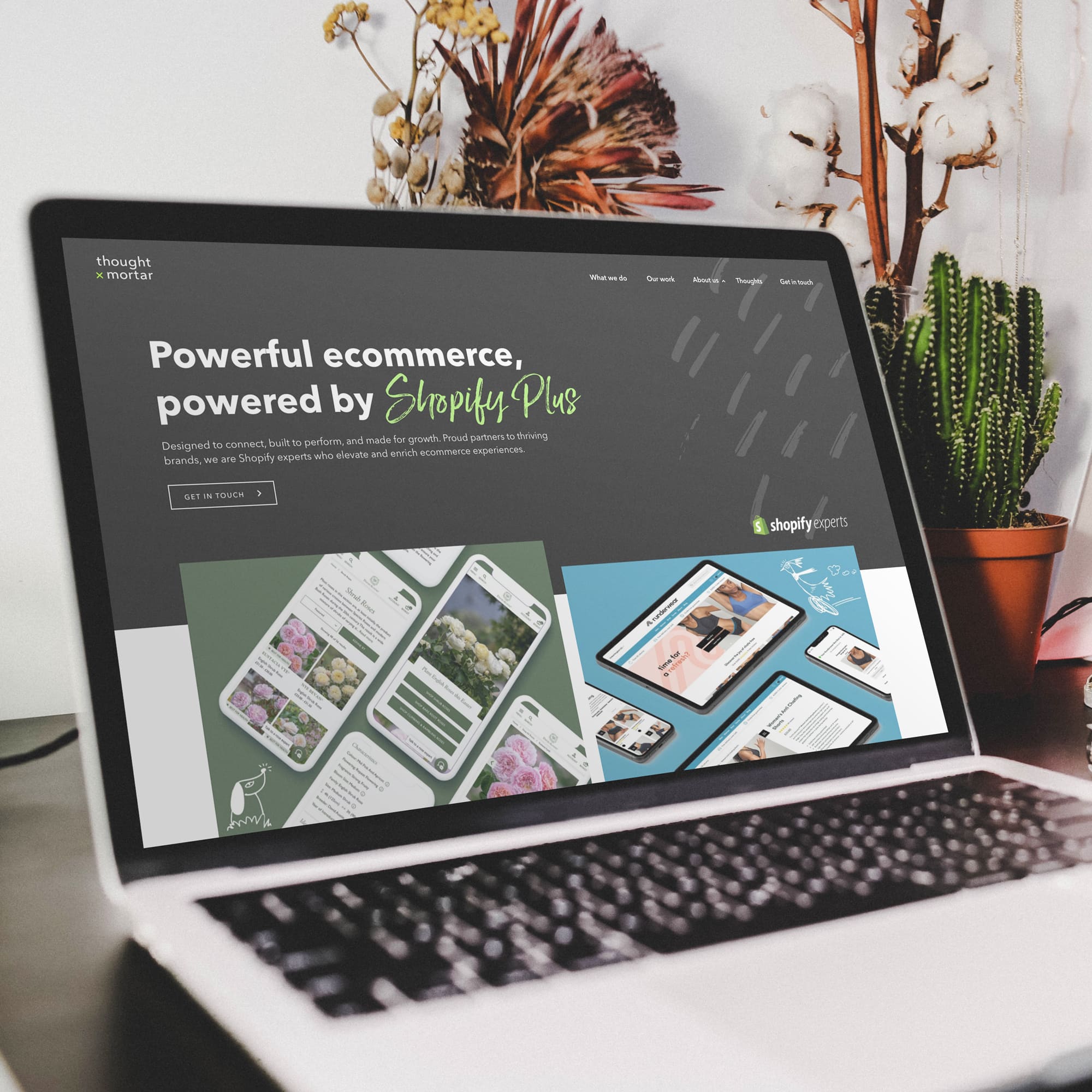
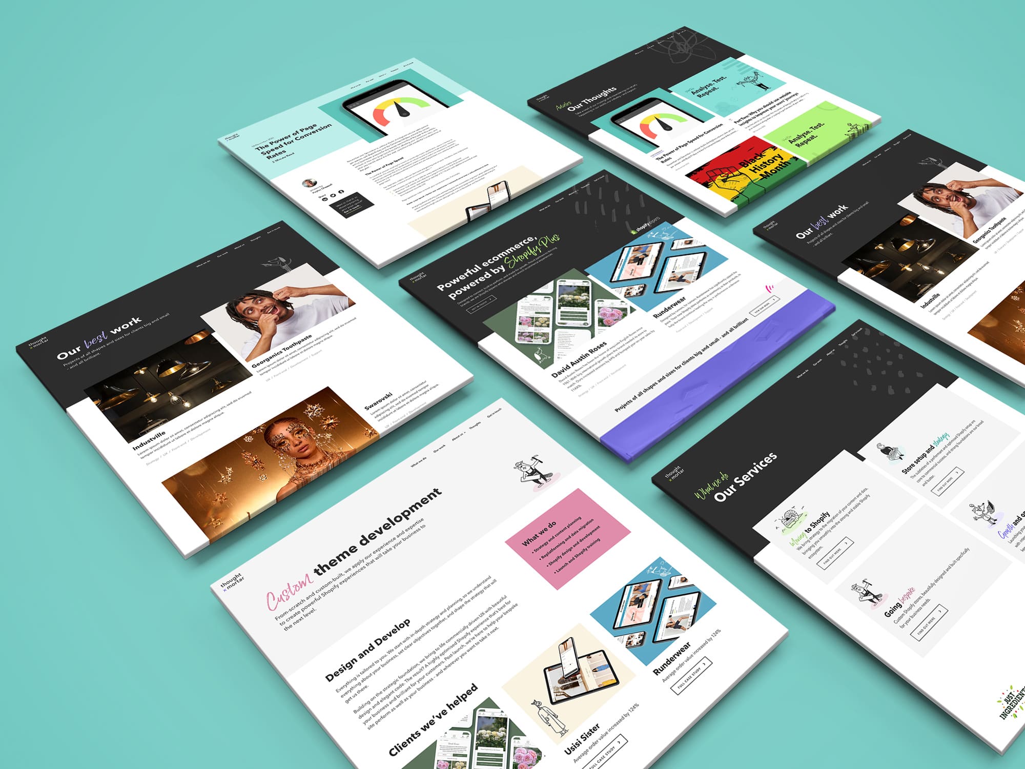
Whilst working at Thought & Mortar I was tasked with refreshing their brand and redesigning their website. Their old website and branding was looking dated and lacked personality, plus, the team had evolved and grown and they wanted the website to represent that.
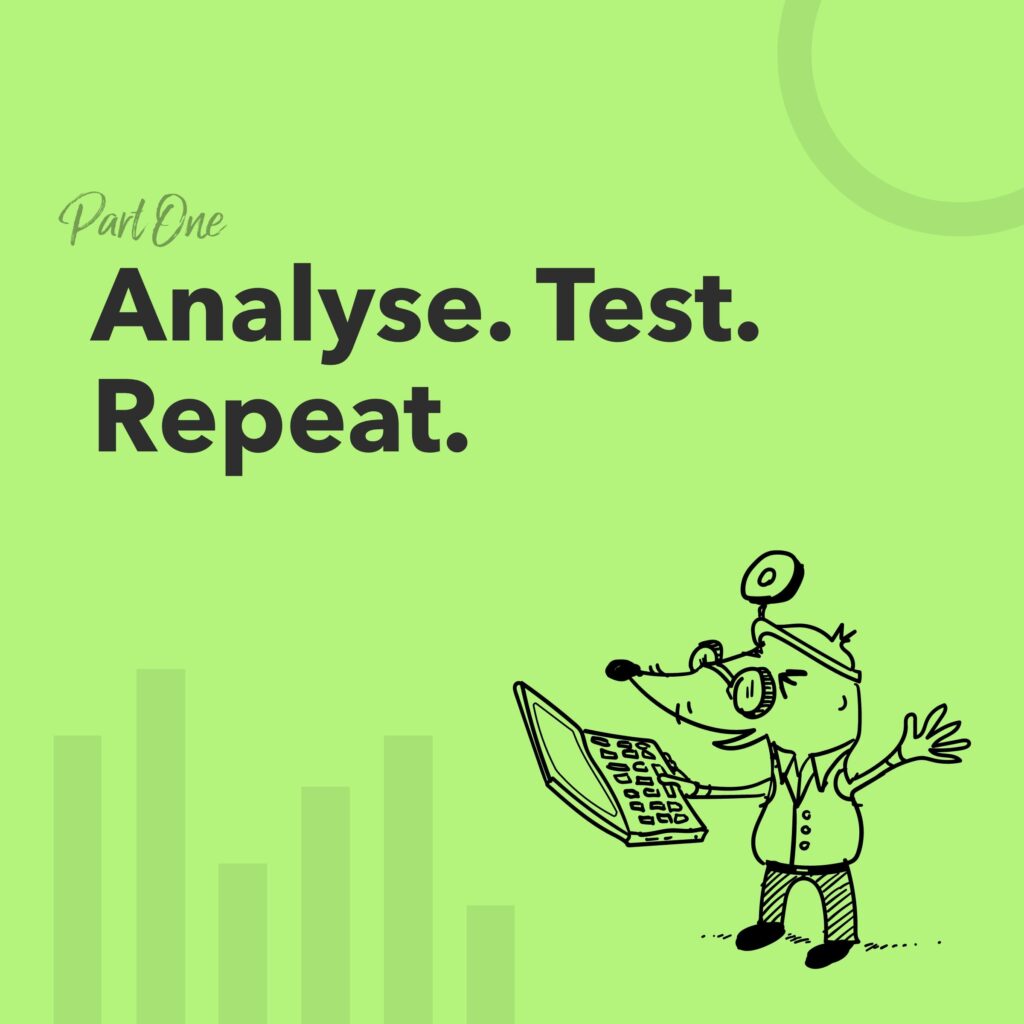
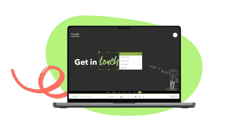
Firstly, I looked at the brand. The old brand consisted of 3 colours – dark grey, white and green. I kept these colours but introduced a secondary colour palette, which included some more bright colours to work with the green. Next, I looked at how I could introduce more personality and I introduced a hand-drawn style typeface to work with the existing typeface. I also included some illustrations, textures and graphic elements. The new brand was used across social media, company documents and presentations, and blog article imagery.
The overall look is now a professional agency that is not only showcasing their technical skills, but their creativity too.
Client:
Thought & Mortar
Agency:
Thought & Mortar
Date:
2022 – 2023
